While the crypto market may seem very lucrative, investing in it can be daunting when exploring it initially. Reading crypto charts and technically analyzing them is crucial as it reassures investors to make informed trading decisions.
The crypto market is driven by a whole lot of global economic factors such as interest rates, inflation, regulatory policies, and geopolitical events. By knowing how to read and analyze the charts, an investor can observe the digital currency’s past performance and identify ongoing trends with strategic planning. This blog will discuss the types of crypto charts, key data points, patterns, and technical indicators necessary to be aware of during trading.
Why Analyze Crypto Charts?
Crypto charts are graphical representations of cryptocurrency’s past price movements, current price, trading volume, different time intervals, and more. Based on the technical analysis of these data, investors and traders can make rational trading decisions, identify investment opportunities, and understand market shifts.
Technical analysis of crypto charts is used to:
- understand how supply and demand affect cryptocurrency’s future price changes.
- help investors make smart choices based on their take on bull and bear movements.
- observe real-time price fluctuations and patterns on charts and identify the entry or exit plans in the trade.
- easily monitor ongoing market shifts and trends.
Key Data Points To Focus On
The chart below shows several key data points a trader must remember while trading on a cryptocurrency platform.
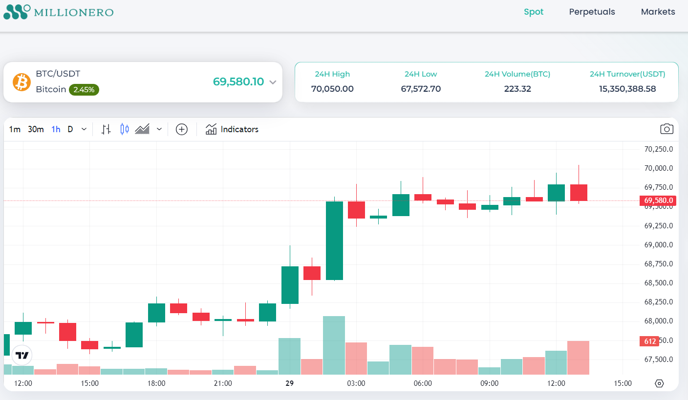
Cryto.com discusses some crucial data points to look for in the crypto charts:
Trading pair: It shows the main currency, Bitcoin (BTC), and the Tether (USDT) quote currency used in this market.
Current cryptocurrency price: Highlights the current rate of BTC being purchased or sold in exchange for USDT. You’ll also see numbers that indicate how much the price has increased compared to yesterday. These numbers can rapidly change depending on the market situation.
24H High/Low: It shows the highest and lowest prices of the cryptocurrency in the last 24 hours.
24H Volume: It reveals how much BTC has been traded in the last 24 hours.
Unit of time: Traders can choose convenient times which reflect the trading market. The range is available from one minute to up to one year. Traders can opt for data for one minute, an hour, one week, a month, or even more.
Price chart: It shows how the price of digital currency has changed over time. In crypto markets, the unit’s price change looks like a candle. All these candles show you how the asset’s price has continuously shifted.
Trading volume: If you carefully observe Millionero’s market chart above, you will see a smaller trading volume chart with lightly shaded bars at the bottom. This indicates the trading volume of BTC, which corresponds to the candles (darker shades of red and green) in the main chart. Longer bars refer to higher trading volumes compared to other times. Green indicates a price surge, while red shows a price drop in the cryptocurrency.
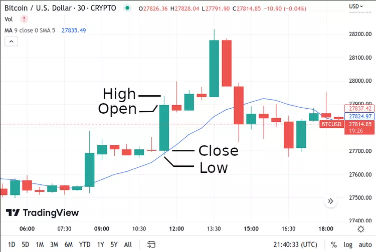
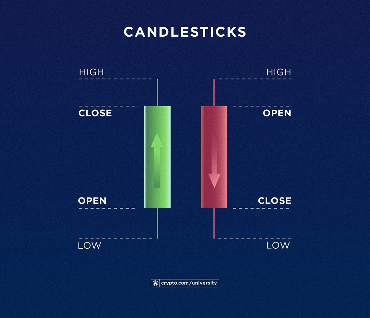
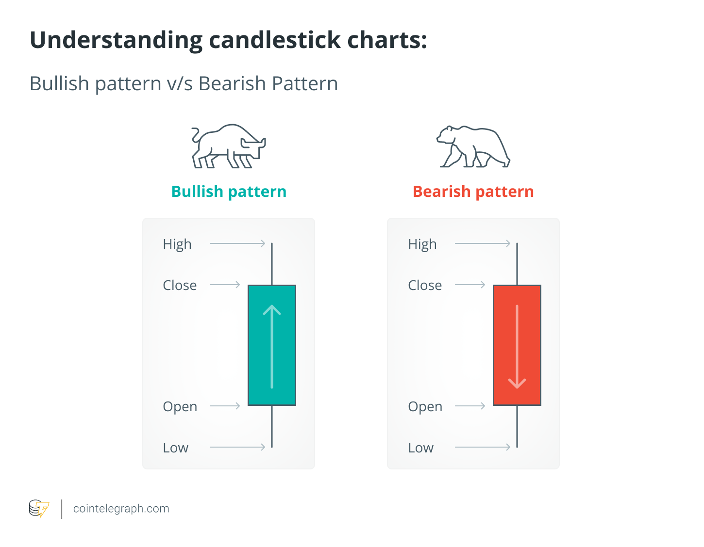
What Are Candlesticks?
Candlestick charts are the most commonly used to analyze the crypto market trends. Each candlestick indicates the price changes for a given time (e.g., 30 minutes). They tell us about opening price, closing price, high, and low. These candlesticks contain a body and a shadow. The body (wide part) indicates the opening and closing prices of the cryptocurrency. Meanwhile, shadows (thin part) represent the highest and lowest price points.
Candlestick Patterns And Trends
Candlestick patterns can be grouped into bullish and bearish trends. A bullish pattern suggests a future price surge of a cryptocurrency, which may push a trader to buy in anticipation of the token’s value increasing. In contrast, a bearish pattern potentially indicates a downward price movement in the future. The upward trend must be monitored closely for a few days before making any decisions.
Bullish and Bearish Patterns
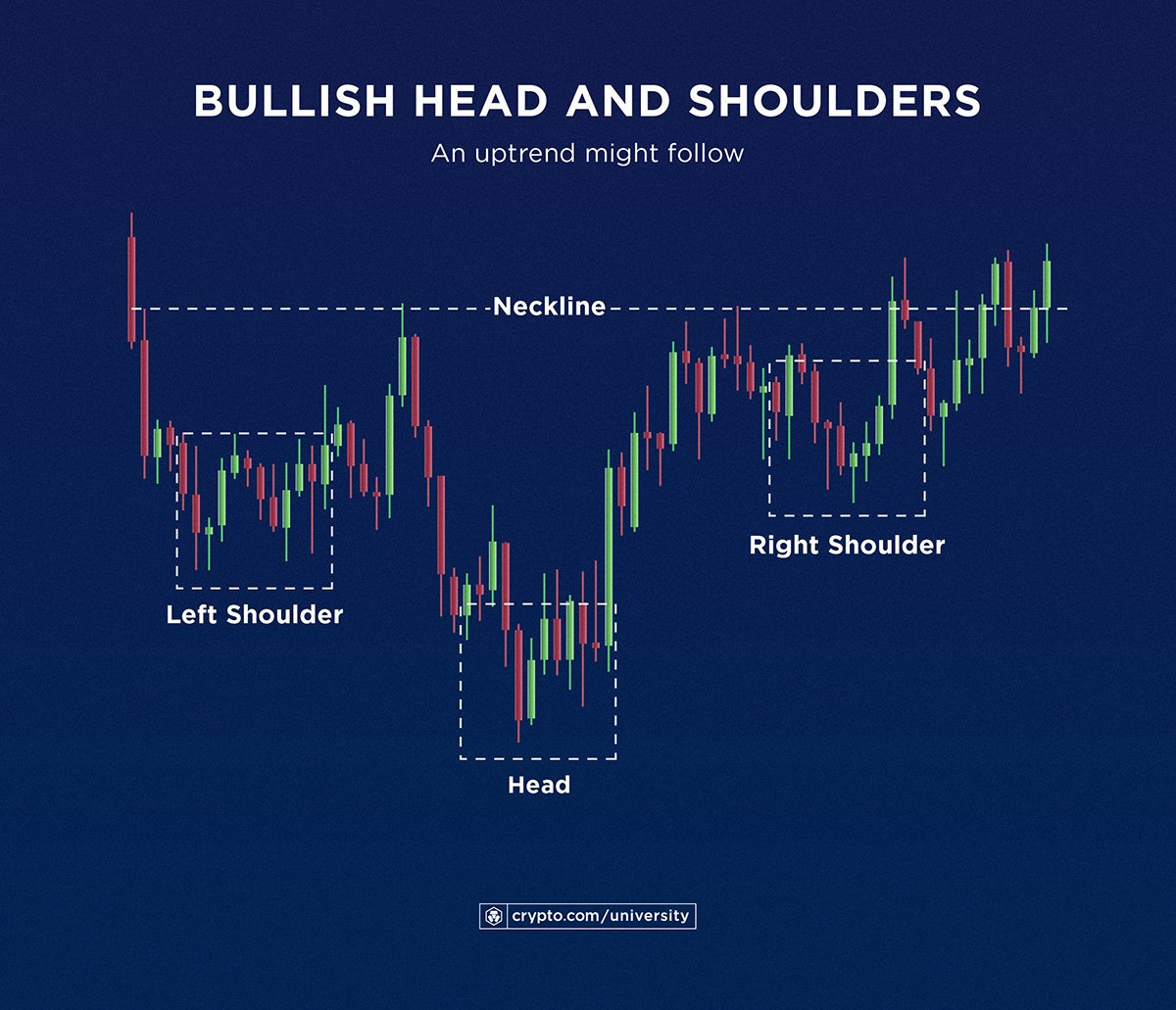
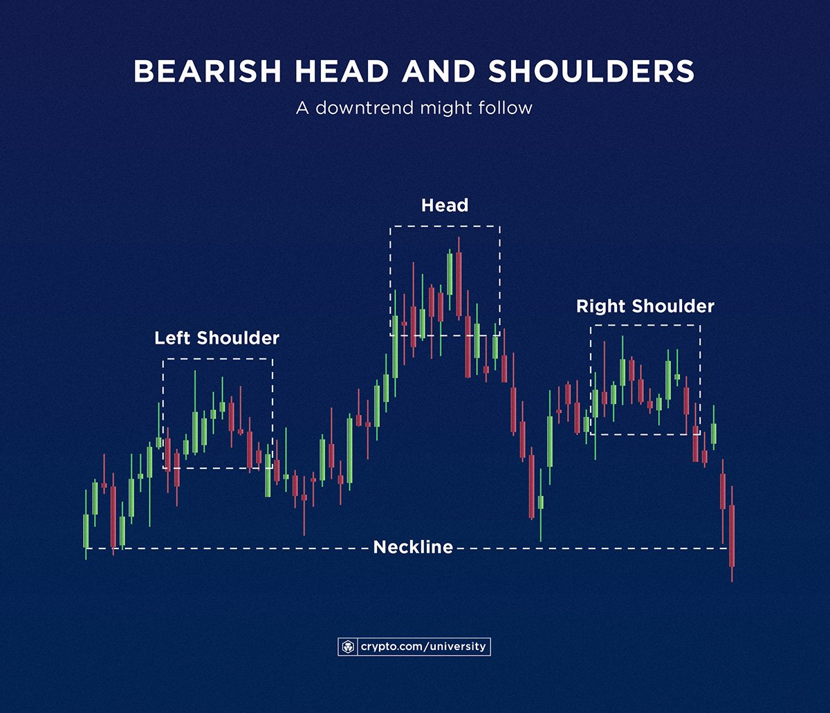
Head and Shoulders
Head and shoulders are reversal patterns distinguished by three peaks or valleys next to each other. It may show up at the peak or bottom of an ongoing trend. A bullish head and shoulders pattern (marked on the left side) may indicate that the cryptocurrency price will increase. Meanwhile, a bearish head and shoulders pattern (marked on the right) may suggest a price downtrend.
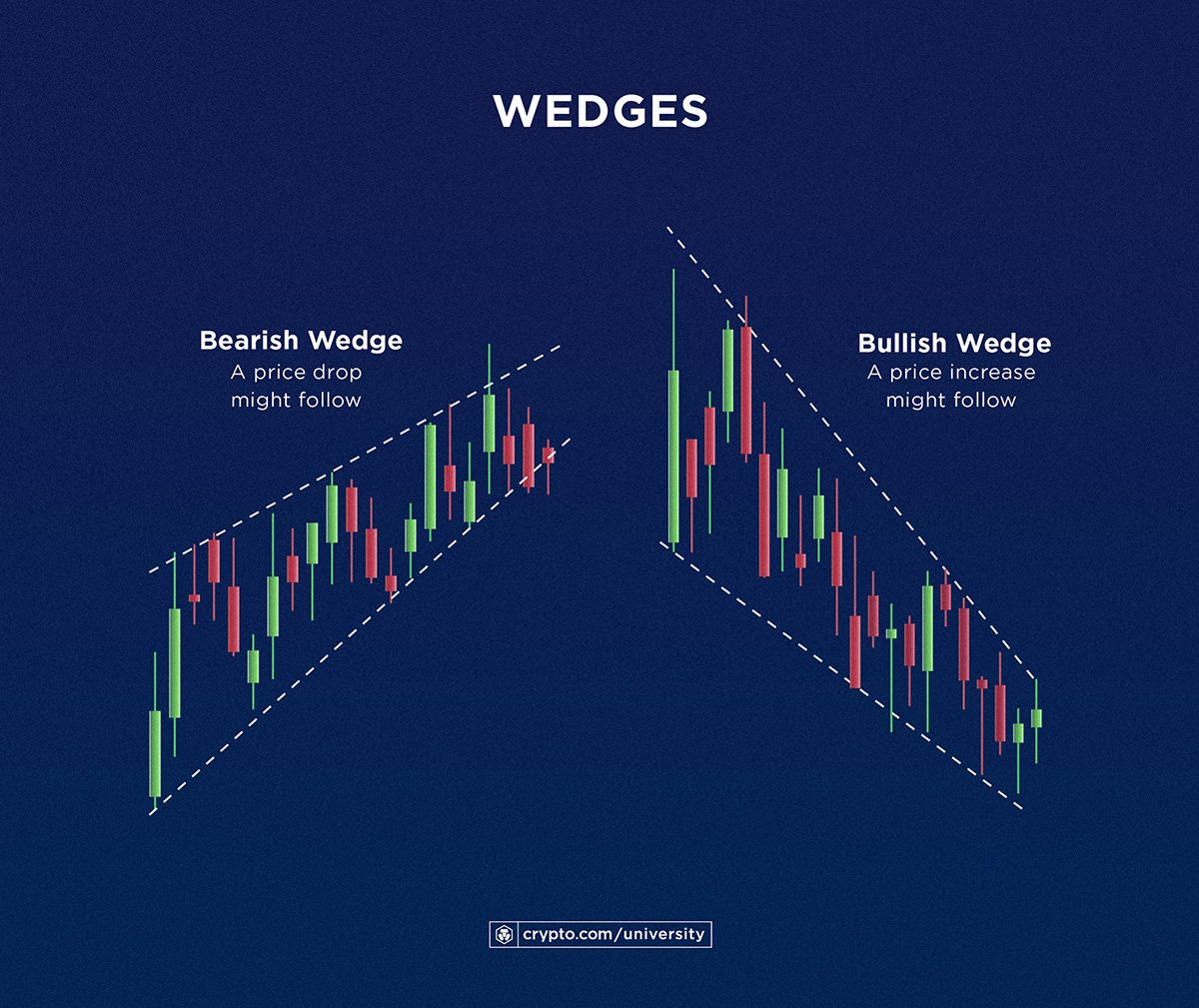
Wedges
Traders can also look for wedge patterns to get a broader crypto market picture. Wedges can be identified in a crypto chart by a line connecting the lower price point movement over a period of time to another line of price surges. When these two lines approach each other from left to right, they are called wedges.
Typically, a bullish wedge is represented by two lines with downward slopes which may indicate that constant price shifts will stabilize and the cryptocurrency’s value will increase. Meanwhile, a bearish wedge represents two lines moving upwards, which may indicate a drop in the crypto price following the sell-off.
Understanding Technical Indicators
Various technical indicators provide greater insight into a crypto trend. They are:
Moving Average Convergence Divergence (MACD)
It consists of a line depicting a difference between the values of 12th and 26th-day exponential moving averages (EMAs) and the signal line (the 9-day EMA of the MACD). When the MACD line turns upwards, crossing the signal line, it indicates a bullish trend. The reverse is true for a bearish pattern.
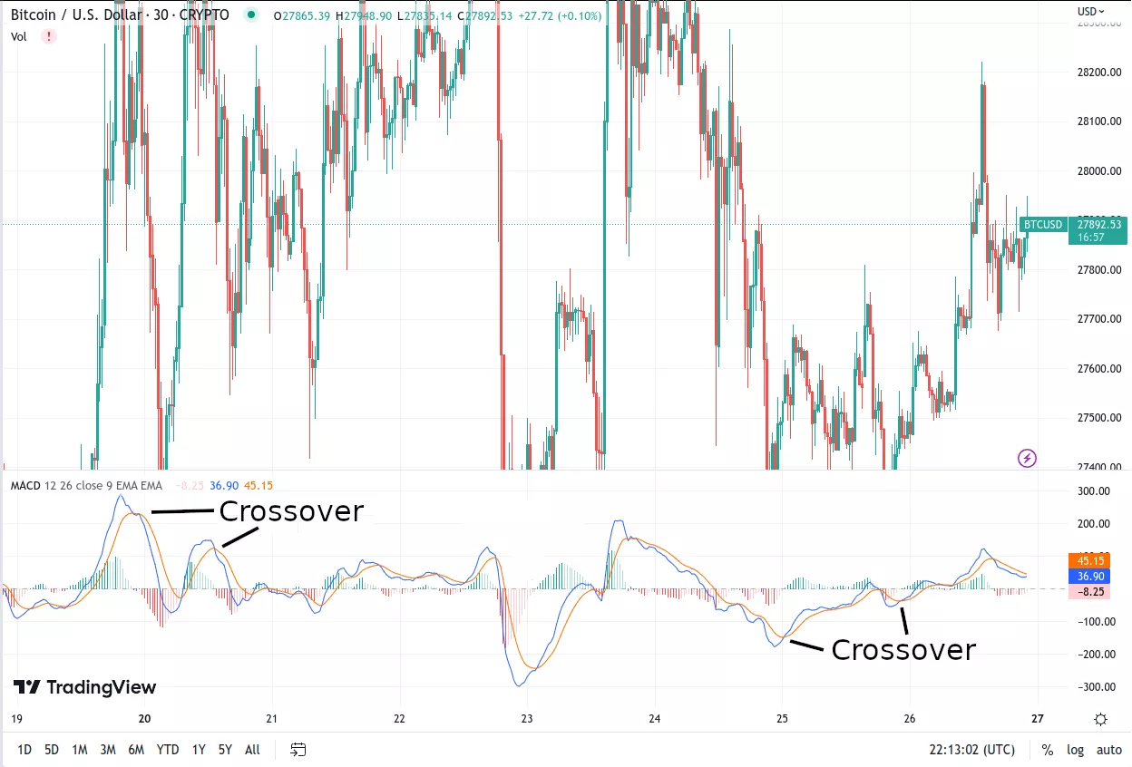
Source | Moving Average Convergence Divergence (MACD)
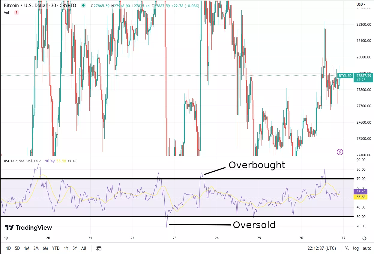
Relative Strength Index (RSI)
The RSI measures the speed of price shifts in the crypto market. Its value lies between 0 and 100. Traders look for values between 30 and 70 to understand market trends. When the RSI value is above 70, the cryptocurrency is considered overbought (rapid selling of assets). When the RSI drops below 30, it is considered oversold (more buying of assets).
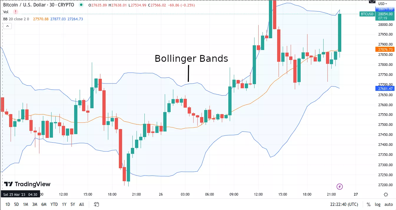
Bollinger Bands
They are momentum indicators used to identify short-term shifts and entry and exit points. They consist of a moving average (MA) and two bands (±2 standard deviations) above or below it. Traders use these technical indicators to identify bullish and bearish patterns.
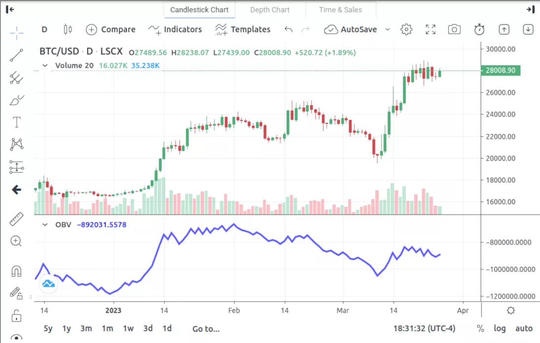
On-Balance Volume (OBV)
The OBV focuses on the crypto’s volume flow to understand the market buying and selling behaviors rather than price changes. The increasing OBV indicates buying pressure, while the decreasing value suggests selling pressure of the crypto asset in the market.
Source | On-Balance volume
Support and Resistance Levels in Charts
Support and resistance levels are crucial indicators which tell us about the supply and demand meet. Traders can study the crypto charts to understand these levels for better entry and exit strategies.
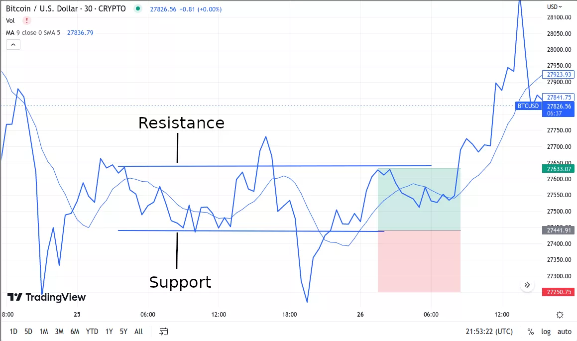
Support refers to a situation where the demand for cryptocurrency rises to match the supply. The asset price stops declining in the downtrend and allows traders to enter long-term trades. If the support level is not steady, prices may fall further and create a new resistance level.
Resistance levels are formed when the supply exceeds the demand for the crypto asset. As the prices increase in the uptrend, the demand will no longer surpass the supply. As more traders try to sell their crypto assets, it creates a cap on the prices.
The Bottomline on Crypto Chart Analysis
Crypto charts are crucial for traders and investors to understand the evolving crypto market. Studying the price shifts of cryptocurrencies allows you to identify crucial market movements through technical analysis. Studying crypto charts and patterns allows you to manage your risk effectively and easily. By keeping an eye out for the technical indicators, you will be able to trade in crypto confidently. If you are a beginner, Millionero is a good platform to start your trading journey.
For more updates, join Millionero, explore our blogs, and follow the latest global crypto news!
Disclaimer: Cryptocurrencies are an inherently volatile asset class, and investments can carry substantial risks. This information is for educational purposes only and should not be construed as financial advice. Always do your own research and conduct due diligence before investing in crypto projects.