Introduction
Charts are like maps for financial markets. They show where prices have been and help you make educated guesses about where they might go. If you’re using Millionero to trade crypto or other assets, knowing how to read charts is one of the most essential skills you can build.
In this guide, we’ll walk through:
- What charts show
- Types of charts
- Key components (price, time, volume)
- Trends, support & resistance
- Basic patterns & indicators
- A sample approach to reading a chart
1. What Charts Show, The Basics
A chart is a visual representation of price vs time. On a typical financial chart:
- Horizontal axis (X-axis) = time (minutes, hours, days, weeks, etc.)
- Vertical axis (Y-axis) = price level
By looking at how price moves over time, you can see trends, reversals, and important zones where price might react.
Also, charts often include volume (how many units were traded) which supports the price information.
2. Types of Charts
There are several ways to plot price data. The most common ones you’ll see on Millionero or other platforms:
| Type | What it shows | Pros / Why use it |
| Line chart | Connects the closing prices over time | Simple and clean; good to see the overall direction |
| Bar chart (OHLC) | Each bar shows Open, High, Low, Close for each period | Gives more detail than a line |
| Candlestick chart | Similar to bar, but more visual: body + wicks/shadows | Very popular among traders, easy to spot bullish vs bearish candles |
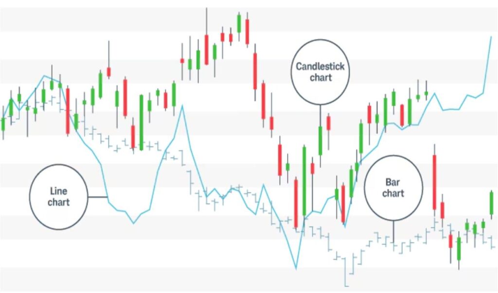
In practice, most people use candlestick charts because they show more actionable detail while remaining visually intuitive.
Understanding a Candlestick
A basic candle has:
- Body: between open and close
- Wicks (shadows): lines above/below body, showing the high and low
- Color: often green (or white) if close > open, red (or black) if close < open
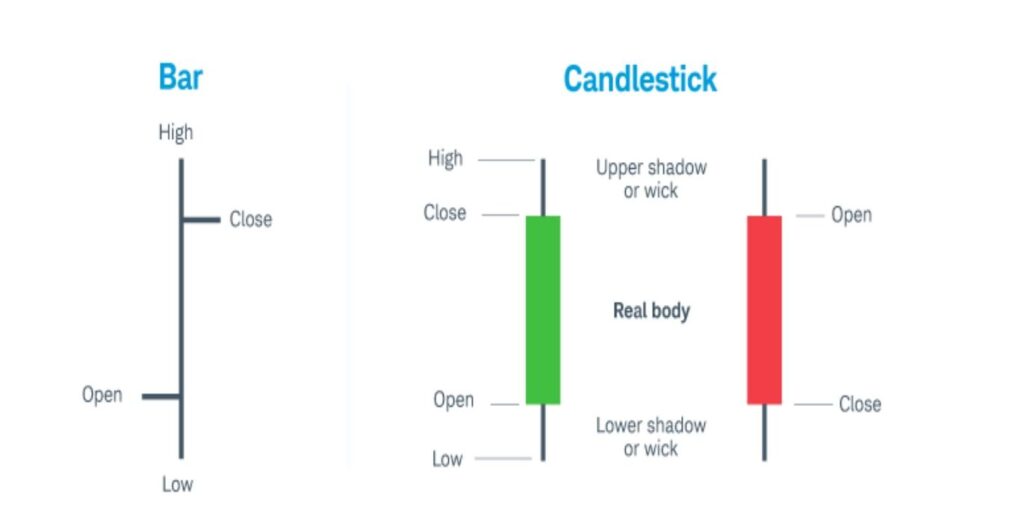
If the candle is green, buyers were stronger that period. If red, sellers dominated. The longer the body, the more the price moved. Long wicks suggest rejection or volatility.
3. Key Components: Price, Time, and Volume
Price & Time Axes
We already covered that time is horizontal and price vertical. Always keep in mind the scale: e.g. a steep upward slope vs a gentle slope, both look different and tell different stories.
Volume
Volume shows how much activity or “interest” there was in a period. High volume with a strong price move tends to validate that move. Low volume might indicate weak conviction.
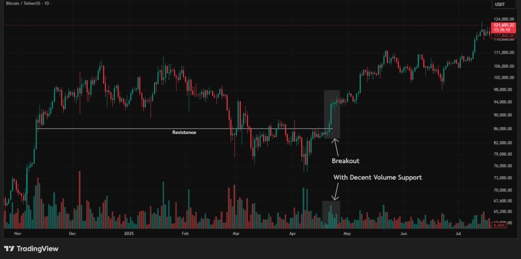
For example, if the price breaks out above a resistance level with high volume, that breakout is more believable than if the volume is low.
Volume is usually shown as bars underneath the main price chart.
4. Trends, Support & Resistance
Trends
- Uptrend: series of higher highs and higher lows
- Downtrend: series of lower highs and lower lows
- Sideways / Range: price moves within a band (flat)
Recognizing the trend helps you align your trades (i.e. it’s safer to trade “with the trend” than against it).
Support & Resistance
- Support = a price level where buying tends to come in, preventing price from falling further
- Resistance = a price level where selling tends to emerge, preventing price from rising further
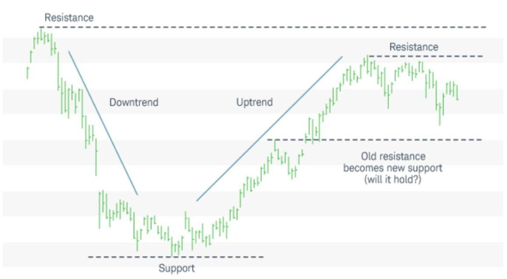
You can imagine them like a “floor” and “ceiling.” Price may bounce off these levels or break through them (breakouts or breakdowns).
When price approaches a support or resistance zone, pay attention to how it behaves (e.g. does it bounce back, or break through with strong volume?).ttention to how it behaves (e.g. does it bounce back, or break through with strong volume?).
5. Basic Patterns & Indicators
Patterns
Here are a few beginner-friendly ones:
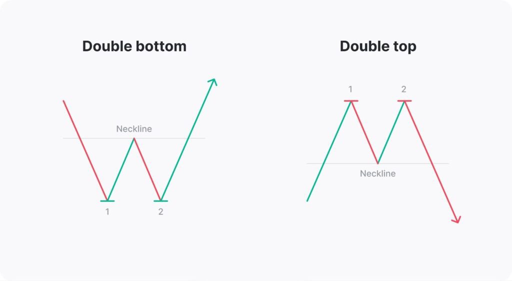
- Double top / Double bottom: two peaks or two troughs; signals a potential reversal
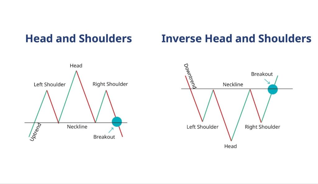
- Head & shoulders: one high peak between two smaller peaks, often signals trend change
- Triangles (ascending, descending, symmetrical): consolidation patterns that often lead to breakout
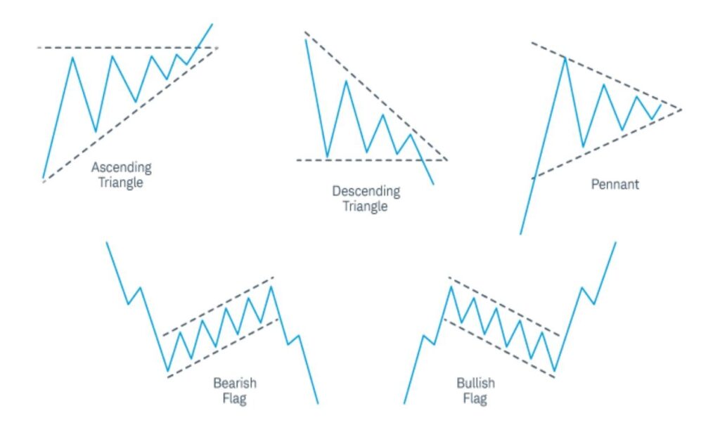
Patterns are helpful signals, but always use confirmation (volume, trend) before trusting them fully.
Indicators
Indicators are formulas applied to price and/or volume data. A few basics to start with:
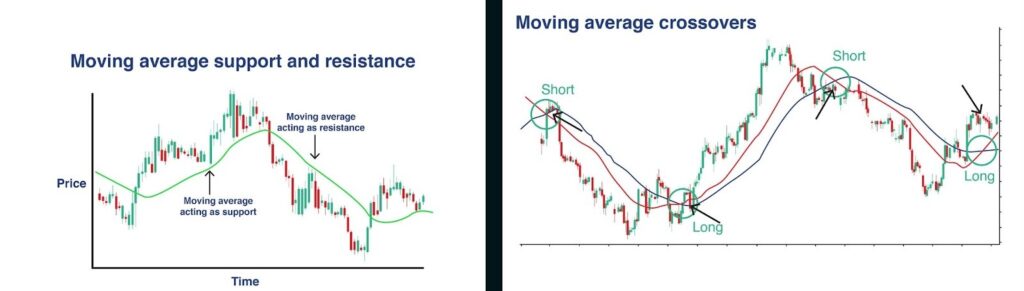
- Moving Averages (MA / SMA / EMA): smooths out price data; helps identify trend direction and possible support/resistance
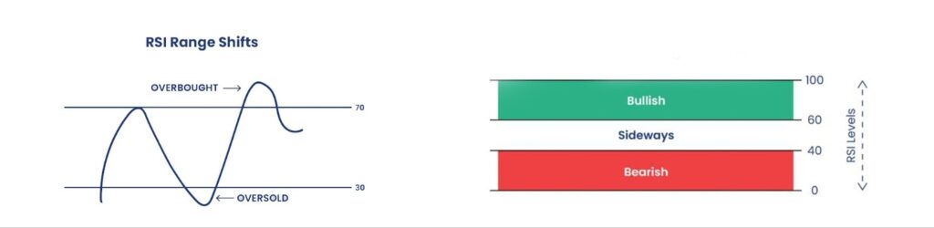
- Relative Strength Index (RSI): shows whether an asset is overbought (too high) or oversold (too low)
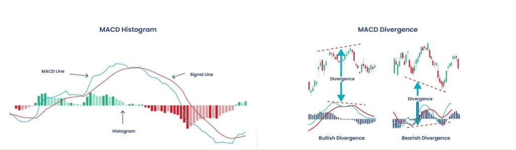
- MACD (Moving Average Convergence Divergence): shows momentum shifts (when short-term and long-term averages cross)
Don’t overload your chart with many indicators at once, too many can be confusing. Start with one or two that complement each other.
6. Step-by-Step: How to Read a Chart
Here’s a suggested approach when you open a chart on Millionero or elsewhere:
- Choose time frame (e.g. 1H, 4H, 1D, depending on your trading style)
- Select chart type (candlestick is usually best for beginners)
- Observe trend direction (up / down / sideways)
- Plot support and resistance zones
- Check volume, do big moves have confirming volume?
- Look for any recognizable patterns
- Refer to indicators (e.g. is RSI overbought? Is price above/below moving average?)
- Make a plan, entry, stop-loss, target
Conclusion & Tips
- Learning to read charts takes practice. Don’t expect to master it overnight.
- Begin by focusing on the core elements: price, time, volume, trend, support/resistance.
- Use patterns and indicators as tools, don’t rely solely on them.
- Always confirm signals (e.g. price action + volume + trend alignment)
- Keep your chart clean: too many lines or indicators can cloud your judgment
Trading charts can feel complex at first, but on Millionero, everything is designed to be simple. You can trade spot and perpetuals, track your charts 24/7, and learn with our easy blog guides.
Millionero does not provide financial advice. Always do your own research. Read more on blog.millionero.com, and trade spot and perps confidently on Millionero.