When you start trading Bitcoin, it can feel overwhelming with all the complex charts and data. One simple tool that many people find helpful is the Bitcoin Rainbow Chart. This colorful chart makes it easier to see where Bitcoin’s price might be going based on its past. So if you’re thinking, “What is the Bitcoin Rainbow Chart?” and wondering how can you use it—this guide is for you.
Key takeaways
- The Rainbow Chart BTC uses colors to show Bitcoin’s long-term price trends.
- It helps you see if Bitcoin might be overvalued (too high) or undervalued (too low) compared to its past prices.
- It’s not perfect for predicting the future, but it can help you make better decisions by showing you where Bitcoin’s price is now compared to its history.
What is the Bitcoin Rainbow Chart?
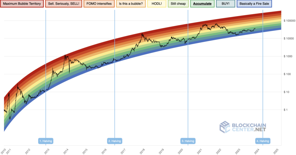
The Rainbow Bitcoin Chart is a tool that visualizes Bitcoin’s historical price movements using a rainbow of colors. Each color band on the chart represents a different price range, making it easier to see when Bitcoin is overvalued or undervalued. This chart is popular because it simplifies the complex data into an easy-to-understand visual guide.
Source | what is Bitcoin Rainbow Chart
The Bitcoin Rainbow Chart consists of seven colored bands, each representing a different percentage increase in Bitcoin’s price. Here’s what each band means:
- Dark Red: 0% to 20% increase
- Red: 20% to 50% increase
- Orange: 50% to 100% increase
- Yellow: 100% to 200% increase
- Green: 200% to 400% increase
- Blue: 400% to 800% increase
- Purple: 800% and above
For instance, the Yellow band might represent a price range of $10,000 to $15,000, indicating that Bitcoin is fairly valued and it could be a good time to hold. On the other hand, the Blue band could represent a price range of $5,000 to $7,500, suggesting that Bitcoin is undervalued and might be a good buying opportunity.
Using this color-coded system, you can quickly assess Bitcoin’s current price compared to its historical performance and make informed decisions about whether to buy, hold, or sell.
History of the Rainbow Bitcoin Chart
The Bitcoin Rainbow Chart was created in 2014 by a user on a Bitcoin forum. It started as a fun way to look at Bitcoin’s price history. Over time, the chart became popular because it uses simple colors to make it easy to see when Bitcoin might be a good buy or when it might be too expensive.
How does the Bitcoin Rainbow Chart work?
The Rainbow Chart BTC works by looking at Bitcoin’s past prices and applying a special curve that grows steadily over time. This curve is then divided into color bands that show different stages of the market. Here’s a breakdown:
| Color Band | What It Means |
| Blue | Bitcoin is very cheap—maybe a good time to buy |
| Light Blue | Still cheap—a strong buying opportunity |
| Green | Fairly priced—a good time to buy more |
| Yellow | Hold—Bitcoin is priced about right |
| Light Orange | Balanced—no strong signal to buy or sell |
| Orange | FOMO (Fear of Missing Out)—prices are getting high |
| Red | Overbought—might be time to sell |
| Dark Red | Very expensive—high risk of a price drop |
These bands are based on the percentage increases in Bitcoin’s price, making it easier to see when the market might be in a buying or selling phase.
How to read and interpret the Bitcoin Rainbow Chart
Using the Rainbow Chart BTC is easy:
- Find the current price band: Look at where Bitcoin’s price is on the chart and see which color it falls into. This will help you decide if it might be a good time to buy, hold, or sell.
- Check the overall trend: Is the price moving up through the colors? That might mean the market is getting stronger (bullish). If it’s moving down, it could mean the market is weakening (bearish).
- Watch the speed of price changes: If the price jumps quickly from blue to orange, people might be buying out of fear of missing out. This can sometimes be a sign to be cautious.
- Use other tools, too: The Bitcoin Rainbow Chart is useful, but it’s always a good idea to use it with other charts and indicators to make the best decisions.
How to use the Bitcoin Rainbow Chart in your strategy

Source | Bitcoin Rainbow Chart
You can use the Bitcoin Rainbow Chart to help you decide when to buy or sell Bitcoin:
- For long-term investing: This chart is best for long-term decisions. Use it to see the big picture of where Bitcoin’s price might be headed.
- Buying Bitcoin: If the price is in the blue or green areas, it might be a good time to buy more Bitcoin because it’s considered cheap.
- Selling Bitcoin: If the price is in the orange or red areas, it might be a good time to sell or hold off on buying more because Bitcoin might be too expensive.
- Combine with other tools: Don’t just rely on this chart. Use other tools and information to make sure you’re making the best choices.
Is the Bitcoin Rainbow Chart accurate?
The Rainbow Bitcoin Chart is helpful, but it has some limitations:
- Based on past data: The chart uses old data, so it doesn’t show what might happen in the future.
- Colors are a guide: The colors are chosen based on past trends and might not always be accurate.
- Doesn’t include everything: The chart doesn’t take into account other factors like news or market changes.
- It’s a lagging tool: This means it shows what has happened, not what will happen next.
Even with these limitations, the rainbow chart BTC can still be a valuable tool when used with other methods to help you make informed decisions.
Understanding the limits of the Bitcoin Rainbow Chart
While the Bitcoin Rainbow Chart is a helpful tool, it’s important to know what it can and can’t do so you don’t rely on it too much.
- Based on old data: The Rainbow Chart BTC uses past prices to show trends. It doesn’t know what’s going to happen in the future, like new laws, technology changes, or big world events that could affect Bitcoin’s price. So, use it as a guide, not as a prediction.
- Subjectivity of color bands: The colors on the Rainbow Bitcoin Chart are based on past trends, and different versions of the chart might show different price ranges for the same colors. This means people might see the chart differently.
- Doesn’t consider outside factors: The chart doesn’t take into account things like trading volume, news, or market feelings, which can all affect Bitcoin’s price. To get a full picture, it’s important to use other tools along with the Bitcoin Rainbow Chart.
- Shows what has already happened: The Rainbow Chart BTC shows trends based on what has already happened. It doesn’t predict what will happen next, so it might not be helpful in fast-changing markets.
- Not good for short-term trading: Because it focuses on long-term trends, the Bitcoin Rainbow Chart isn’t the best tool for making quick trading decisions. For short-term trades, you might want to use other tools like moving averages.
- Can be misleading: The chart’s simplicity might make you feel more confident than you should be. It’s easy to rely too much on the chart without thinking about other important factors, which could lead to bad decisions.
Beyond Bitcoin: Rainbow Charts for Altcoins
The success of the Bitcoin Rainbow Chart has led to the creation of similar charts for other cryptocurrencies like Ethereum. These charts work the same way, using colors to show different price stages based on historical data. However, the price points and interpretations might differ because each cryptocurrency has its own market behavior.
Bottom line
The Bitcoin Rainbow Chart is a useful tool for understanding Bitcoin’s long-term price trends. It helps you see where Bitcoin might be headed based on its history. However, it’s important to remember that this chart is just one tool among many. Use it alongside other indicators and research to make the best trading decisions.
To learn more about such concepts in crypto trading, join Millionero today!
FAQs
1. What are the main limitations of the BTC Rainbow Chart?
The Bitcoin Rainbow Chart only shows past price trends and doesn’t account for real-time market changes or news. The colors are based on past data, so they might not always be accurate.
2. Should I use the Bitcoin Rainbow Chart for short-term trading?
No, the Bitcoin Rainbow Chart is better for long-term trading. For short-term trades, use other tools that react faster to market changes.
3. How accurate has the BTC Rainbow Chart been?
While the rainbow Bitcoin chart has been useful in the past, it’s not always accurate. Bitcoin’s price has sometimes moved outside the chart’s predictions, so it’s important to use it as a guide, not a guarantee.
4. Can I use it for altcoins like Ethereum?
Yes, there are similar charts for other cryptocurrencies like Ethereum. However, each chart is different, so make sure you understand how the specific chart works before using it.
Disclaimer: Cryptocurrencies are an inherently volatile asset class, and investments can carry substantial risks. This information is for educational purposes only and should not be construed as financial advice. Always do your own research and conduct due diligence before investing in crypto projects.