If you’ve ever seen two lines dancing below Bitcoin’s chart and wondered what they mean, that’s probably the MACD, short for Moving Average Convergence Divergence.
It’s one of the most popular momentum indicators in trading, and it helps traders spot when the market might be speeding up, slowing down, or about to reverse.
Let’s break it down simply.
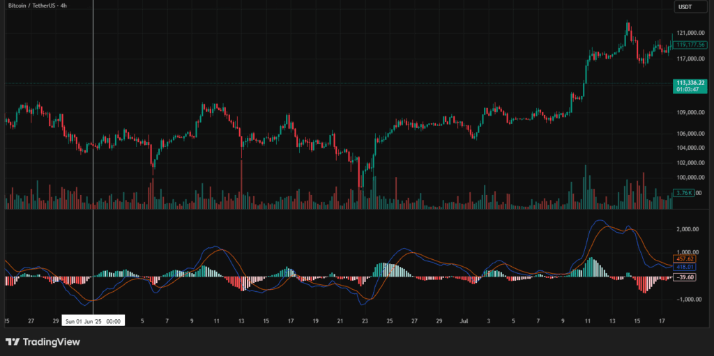
🔵 1. What Is the MACD?
It is made of three main parts:
- The MACD Line – this is the difference between two EMAs (usually the 12 EMA and 26 EMA).
- The Signal Line – this is a 9 EMA of the MACD line itself.
- The Histogram – those green and red bars that show how far apart the two lines are.
Think of it like this:
- The MACD Line shows short-term momentum.
- The Signal Line smooths that momentum out.
- The Histogram is like a heartbeat monitor, showing how strong the move is.
When the lines move close together, momentum is slowing. When they spread apart, the market is heating up.
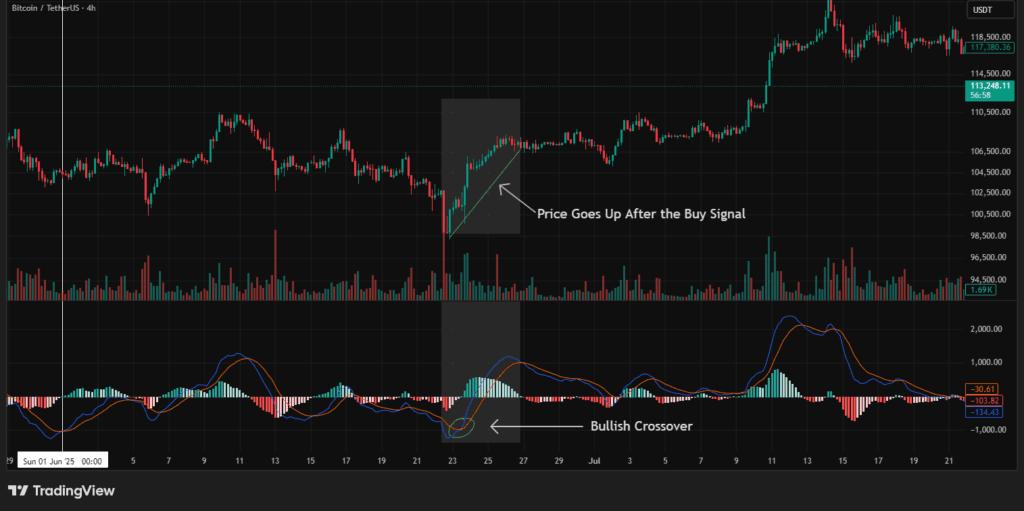
🟢 2. MACD Crossovers – Where the Magic Happens
Crossovers are the main reason traders use MACD.
- When the MACD Line crosses above the Signal Line, it’s called a bullish crossover, a potential buy signal.
- When the MACD Line crosses below the Signal Line, it’s a bearish crossover, a possible sell signal.
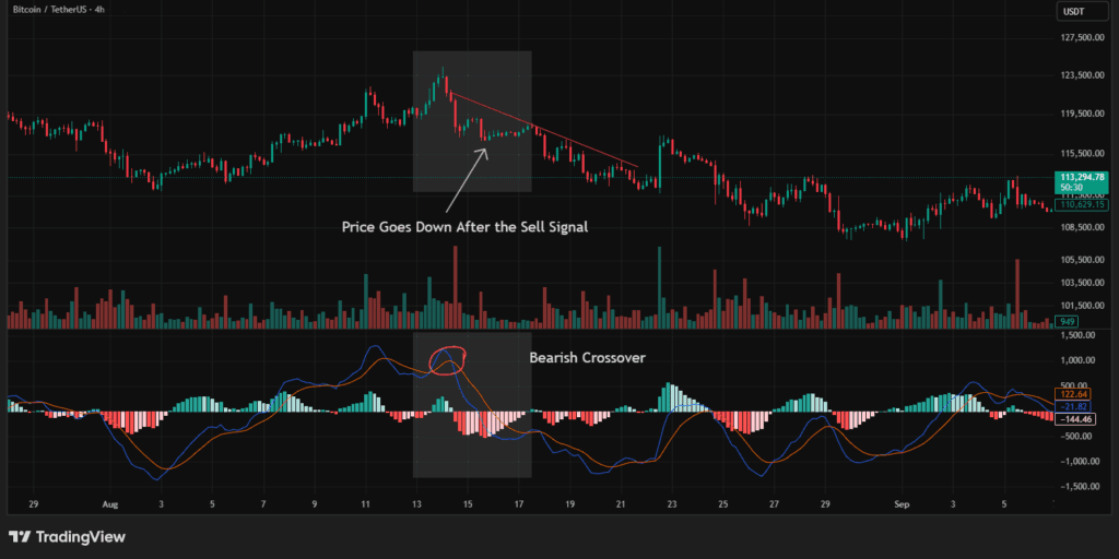
You’ll often see traders using it on the 4-hour or daily chart to confirm a trend’s direction.
A clean crossover with growing green bars on the histogram can mean momentum is building up.
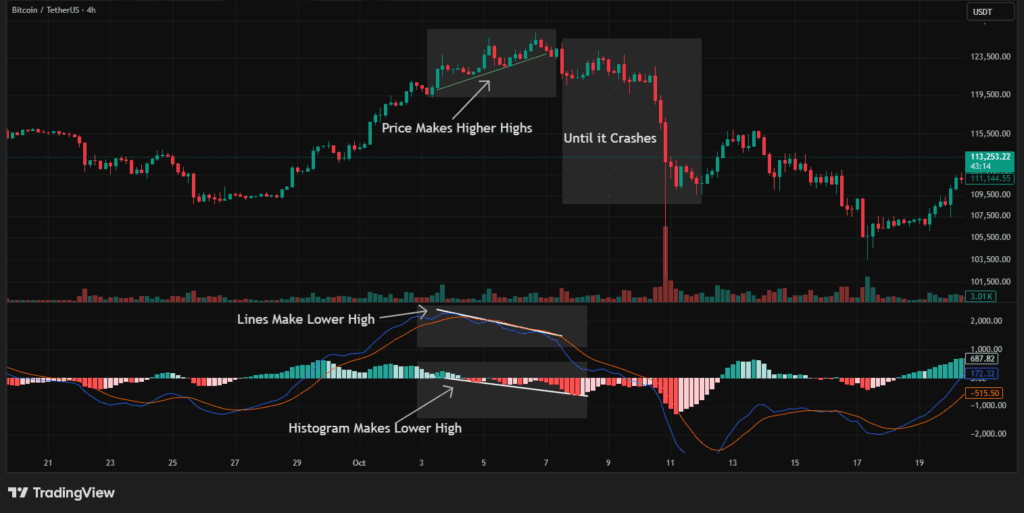
🟡 3. MACD Divergences – Early Warnings
Another reason traders love MACD is divergence.
That’s when the price moves in one direction but MACD moves in the opposite direction.
- If Bitcoin makes a higher high, but it makes a lower high, that’s bearish divergence, momentum is fading even if price rises.
- If Bitcoin makes a lower low, but MACD makes a higher low, that’s bullish divergence, buyers may be returning quietly.
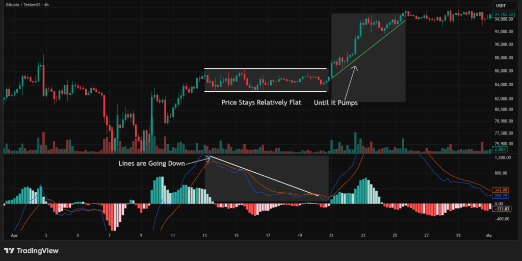
Divergences don’t always mean instant reversals, but they’re like the weather forecast saying “a storm might be coming.”
🔴 4. Common Mistakes
Many beginners jump into trades after every crossover, and that’s a trap.
It works best with context, not alone.
Always check:
- The trend direction on higher timeframes.
- The volume to confirm momentum.
- Other indicators like RSI or EMA for stronger confirmation.
When combined, MACD becomes a powerful support tool rather than a false signal machine.
Final Thoughts
It isn’t complicated, it’s a story of momentum told through lines and bars.
It helps traders see when the wind is changing before the price even does.
So next time you look at Bitcoin’s chart, pay attention to:
- Line crossing the Signal Line (momentum shift),
- Histogram expanding or shrinking (strength of the move), and
- Divergences that might hint at trend exhaustion.
It won’t predict the future, but it will whisper clues about what’s happening beneath the surface.
This article is not financial advice. Please do your own research (DYOR) before making any investment decisions. You can start DYOR at blog.millionero.com. When you feel ready, trade spot and perpetual futures securely on Millionero.